
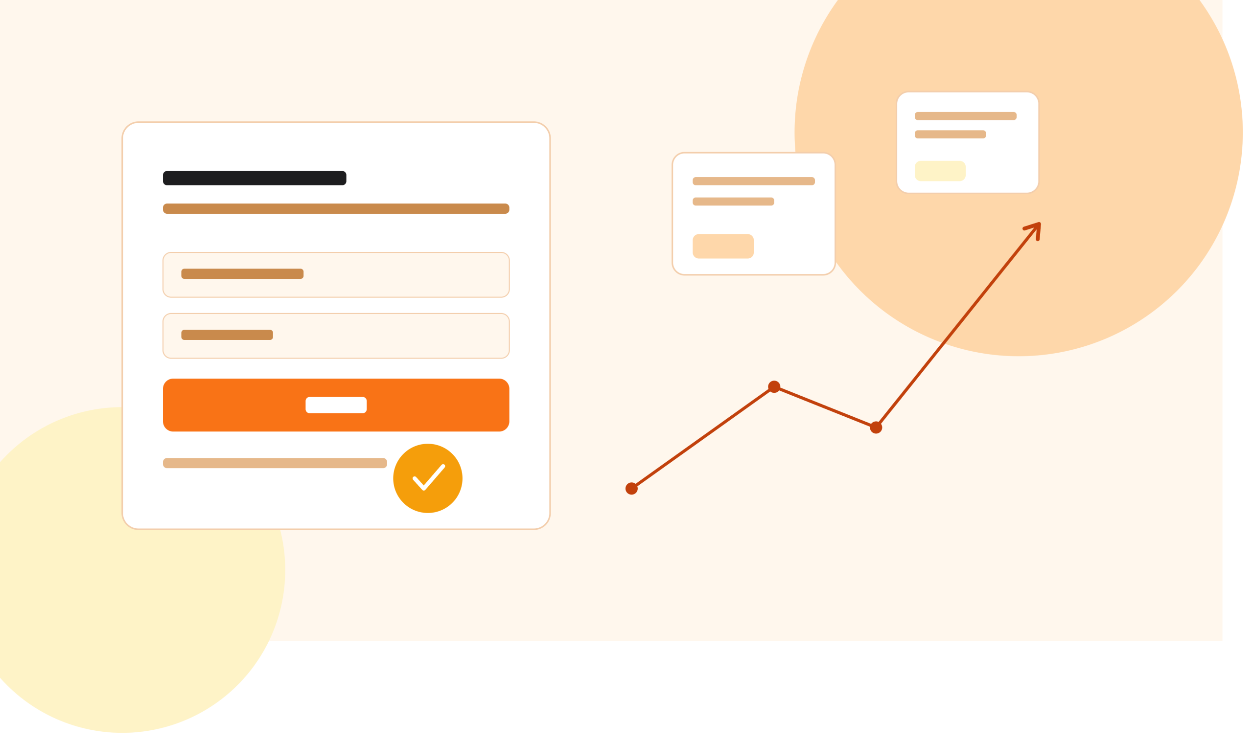
Most signup page advice comes from one place: ecommerce checkout testing. Reduce fields. Add a progress bar. Remove distractions. Sound familiar?
The problem is this. A signup page is not a checkout page. Nobody is buying anything yet. They are deciding if they trust you with their email, their time, or both. That is a different moment. It needs a different plan.
This guide walks through three changes that work well for signup pages. Not tricks. Not hacks. Just clear reasons why each one works, and how to test it on your own site.
By the end, you will know:
- Why most signup page advice fails
- Three specific changes to test first
- The thinking behind each one
- Common mistakes to avoid
- How to test changes without guessing
Let’s start with why so much advice falls flat.
Why Most Signup Page Advice Doesn’t Work
Search “how to improve signup conversion” and you will find the same five tips, over and over. Fewer fields. Add a progress bar. Use a strong headline. Add social proof. Make the button bigger.
These tips are not wrong. They are just incomplete. They were built for checkout pages, where the visitor has already decided to buy. On a signup page, the visitor has not decided anything yet. They are still asking themselves, “Should I trust this?”
That is the real question your signup page has to answer. Not “how do I get more clicks.” But “how do I remove the doubt that is stopping this person right now.”
Once you see it this way, the fixes look different too.
What Is Signup Page Conversion Rate?
Your signup conversion rate is simple. It’s the number of people who complete your signup form, divided by the number of people who land on the page.
For example, if 1,000 people visit your signup page and 40 complete it, your conversion rate is 4%.
There is no single “good” number here. It depends on your industry, your traffic source, and what you are asking people to sign up for. A free newsletter will convert higher than a paid trial that needs a credit card. What matters more than the number itself is the trend. Is it going up or down over time? Are your changes helping or hurting?
Now let’s get into the three changes.
1. Cut the Form Fields You Don’t Need Yet
Every field on your form is a small cost. Name, email, company size, phone number, “how did you hear about us.” Each one asks the visitor to stop and think. And thinking creates doubt.
Here is the part most advice gets wrong. It is not just about the number of fields. It is about which fields, and when you ask for them.
Four fields are not twice as hard as two. They are harder than that. Each new field is a fresh chance for someone to give up. Psychologists call this “cognitive load.” The more decisions a person has to make, the more tired they get, and the more likely they are to quit.
The Fix: Ask for Less, Later
Instead of removing all your fields, ask yourself this question. What is the smallest amount of information I need right now to get this person to the next useful step?
Everything else can wait. You can collect it:
- Inside the product, after they’ve had a small win
- During onboarding, one step at a time
- Later, when the extra data actually improves their experience
Many companies over-ask on the first form because sales or marketing wants more data upfront. That is a mistake. Every extra field you add now costs you signups later. It is far easier to ask a happy user for more information than to ask a stranger who has not seen any value yet.
A Simple Rule
If you can launch your product, your onboarding, or your free trial with just an email address, start there. Add a password step only if you truly need one right away. Many tools now use “magic links” (a link sent by email) to skip the password step completely. Fewer steps, fewer chances to lose someone.
What to Test
- Remove one field at a time and measure the difference
- Try moving “nice to have” fields to a later step, after signup
- Test a single-field form (just email) against your current form
2. Replace Generic Trust Signals With Specific Ones
“Trusted by 10,000+ companies,” followed by a row of logos. You have seen this on almost every signup page. It used to work. Now it barely registers, because everyone does it. It has become background noise, like a stock photo of people smiling at laptops.
The visitor’s brain has learned to skip it.
Why Specific Beats Generic
What actually lowers hesitation is detail. A number, a name, or a result the visitor can picture. Compare these two lines:
- “Trusted by thousands of businesses”
- “Used by 40 finance teams to cut month-end close time by two days”
The second one is harder to write. It requires a real number and a real result. But it does something the first one cannot. It answers a question the visitor is quietly asking: “Will this actually work for someone like me?”
This is why case studies, even short ones, tend to beat logo walls. A logo wall says “other people used this.” A specific result says “here is what happened when they did.”
Match the Trust Signal to the Doubt
Different visitors have different doubts. Some worry about price. Some worry about setup time. Some worry about whether it will actually solve their problem. A single trust signal cannot answer all of these at once.
A good approach is to place small, specific reassurances near the exact point of doubt. For example:
- Near the price: “No credit card required”
- Near the form: “Takes about 2 minutes”
- Near the button: “Cancel anytime, no questions asked”
Each one removes a different kind of doubt, right where that doubt shows up.
What to Test
- Replace a logo wall with one specific, numbers-based result
- Add a short reassurance line directly under your signup button
- Test a real customer quote (with permission) against a generic trust badge
3. Say What Happens Next, in Plain Language
Many signup pages do a good job selling the decision to sign up. Then they go quiet on what happens right after someone clicks the button. That silence creates hesitation, especially for anyone who has had a confusing onboarding experience before. Most people have.
Think about the last time you signed up for something new. Did you wonder, even for a second, “What happens now? Will this take five minutes or fifty? Do I need my credit card? Will someone call me?” That small moment of not knowing is enough to make people close the tab.
The Fix Is One Sentence
You do not need a long explanation. One clear sentence often does the job:
“You’ll get instant access. No card required. Setup takes about 2 minutes.”
This single line removes more doubt than another headline rewrite ever will. It tells the visitor exactly what to expect, in plain words, with no surprises hiding after the click.
Why This Works
People are not just deciding whether to sign up. They are deciding whether they want to deal with whatever comes next. If that next step feels unclear, the safer choice is to do nothing. Doing nothing feels safe. Clicking into the unknown does not.
When you spell out what happens after signup, you are not just informing people. You are giving them permission to move forward, because you have already answered the question they were about to ask themselves.
What to Test
- Add a single line under your form describing what happens after signup
- Test different levels of detail (one line vs. a short three-step list)
- Try adding a small “what to expect” section directly on the signup page, not buried in a follow-up email
The Pattern Underneath All Three
Look closely at these three changes. None of them are checkout tactics borrowed and relabeled for signup pages. Each one targets the same thing: the specific hesitation that shows up before someone has decided to trust you, not after.
- Fewer fields lowers the effort cost of the decision
- Specific trust signals lower the doubt about whether it will work
- Clear next steps lower the fear of the unknown after clicking
That is the real lesson here. The tactic is not the point. The tactic is just a tool for solving a specific kind of doubt. If you copy a tactic without understanding the doubt it was built to solve, it might not work on your page at all.
Common Mistakes to Avoid
Even with the right ideas, it is easy to get the details wrong. Here are a few mistakes worth watching for.
Testing Too Many Things at Once
If you change your form, your trust signals, and your headline all in the same test, you will not know which change actually helped. Change one thing at a time, or use a proper multivariate test if you have enough traffic to support it.
Stopping a Test Too Early
Many tests get called as “winners” or “losers” after just a day or two. That is rarely enough data. Random noise can easily look like a real result in the first 48 hours. Wait until you have enough visitors and enough time (often at least one to two full business cycles) before you trust the result.
Copying What Worked for Someone Else
A tactic that worked for one company might not work for yours. Your visitors, your industry, and your traffic source are all different. Always treat someone else’s result as a hypothesis to test, not a rule to copy.
Ignoring Mobile Visitors
A form that looks clean on a laptop can feel cramped and frustrating on a phone. Always check how your signup page looks and works on mobile before you launch a test. For many businesses, mobile traffic is now the majority, not the exception.
Adding Trust Signals Without Proof
A specific number only builds trust if it is true and verifiable. Never use a made-up statistic or an exaggerated result. If you do not have a real number yet, it is better to leave that section out than to guess.
How to Test These Changes Properly
Making these changes without testing them is a gamble. Testing them properly turns that gamble into a repeatable process. Here is a simple way to approach it.
Step 1: Pick One Change
Choose the single change you think will have the biggest impact. Do not try to fix everything on the page at once.
Step 2: Set a Clear Goal
Decide exactly what you are measuring. Usually this is the percentage of visitors who complete the signup form. Write this number down before you start.
Step 3: Run the Test Long Enough
Let the test run until you have enough visitors to trust the result. This will vary by traffic level, but rushing a test almost always leads to the wrong conclusion.
Step 4: Check for Statistical Significance
This simply means checking whether your result is likely to be real, not just random luck. Most testing tools calculate this for you. If your tool shows a low confidence level, keep the test running.
Step 5: Apply the Result, Then Test the Next Thing
Once you have a clear winner, make it the new default. Then move on to your next hypothesis. Conversion rate work is never really “finished.” It is an ongoing habit, not a one-time project.
Frequently Asked Questions
What is a good signup page conversion rate? There is no single good number. It depends on your industry, your traffic source, and what you are asking visitors to sign up for. Focus on your own trend over time rather than comparing to a generic benchmark.
How many fields should a signup form have? As few as possible for the first step. Many successful signup forms ask for nothing more than an email address, and collect other details later.
Do trust signals actually improve conversion? Specific, provable trust signals can help. Generic ones, like an unlabeled row of logos, tend to have little effect because visitors have learned to skip past them.
How long should I run a signup page test? Long enough to reach statistical significance, which usually means enough visitors and enough time to smooth out normal day-to-day noise. This varies by traffic volume, so there is no fixed number of days that works for every site.
Should I test on mobile and desktop separately? Yes, where you have enough traffic to do so. Visitor behavior often differs between mobile and desktop, and a change that helps one can sometimes hurt the other.
Thoughts
Signup page conversion is not about collecting a list of tricks. It is about understanding the doubt sitting in a visitor’s mind at that exact moment, and removing it, one honest step at a time.
Cut the fields you do not need yet. Replace vague trust signals with specific, provable ones. Tell people clearly what happens the moment they click. Do all three, and you will remove far more friction than any single “best practice” tip ever could on its own.
The tactic is never the real lesson. The diagnosis is. Once you know exactly what is causing hesitation on your page, the right fix usually becomes obvious.
A Quick Checklist You Can Use Today
Use this list as a starting point. Go through your own signup page and check each item.
- Does the first step ask for only the information you truly need right now?
- Could any field be moved to a later step, after signup?
- Is there at least one specific, provable trust signal on the page?
- Have you removed vague claims that cannot be backed up with a real number?
- Is there a clear line telling visitors what happens right after they click?
- Does the page look clean and easy to use on a phone, not just a laptop?
- Is your call-to-action button clear about what will happen next?
- Have you tested one change at a time, rather than several at once?
- Did your last test run long enough to reach a reliable result?
- Is the page free of surprises that only appear after signup, like a hidden fee or a required credit card?
If you can tick most of these boxes, your signup page is already ahead of most.
A Simple Example Walkthrough
To make this concrete, here is a simple, hypothetical example. Imagine a signup page for a project management tool.
Before: The form asks for full name, work email, company name, company size, phone number, and job title. Above the form is a headline that says “The Ultimate Way to Manage Your Projects,” followed by a wall of ten customer logos. Below the button, there is no explanation of what happens next.
After: The form asks for only a work email. The headline is replaced with a specific line: “Set up your first project in under 3 minutes.” Underneath the logos, one specific result replaces the wall: “Teams using tools for reporting saving an average of 4 hours a week on status updates.” Below the signup button, a short line reads: “You’ll land straight in your new workspace. No credit card needed.”
Notice what changed. The form got shorter. The trust signal got more specific. And the visitor now knows exactly what happens the second they click. None of these changes require new features or a design overhaul. They require rethinking what the visitor is actually worried about at that moment.
This is the kind of thinking worth applying to your own page, using your own real numbers once you have them tested and confirmed.
Tools That Can Help You Test
You do not need an expensive setup to start testing your signup page. A few common options include:
- A/B testing platforms, which let you show two versions of a page to different visitors and compare results
- Heatmap and session recording tools, which show you where visitors click, scroll, and hesitate
- Form analytics tools, which show exactly which fields cause people to abandon a form
- Simple analytics, to track your baseline conversion rate before and after any change
You do not need all of these at once. Start with whichever tool answers your biggest open question. If you are not sure why people leave your form, a heatmap or session recording is often the fastest way to find out.
When to Bring in Outside Help
Many teams can make real progress on their own using the ideas in this guide. But there comes a point where outside eyes are useful. This is often true when:
- You have tried the obvious fixes and results have plateaued
- You are not sure how to properly test for statistical significance
- Your traffic is high enough that small mistakes in testing are costly
- You want a second opinion before making a major change to a page that drives real revenue
There is no shame in asking for help at this stage. Conversion rate work rewards experience, and someone who has run hundreds of tests across different industries will often spot issues that are hard to see from the inside.
More Frequently Asked Questions
Should I redesign my whole signup page at once? It is usually better to make one change at a time and measure the result. A full redesign feels exciting, but it makes it impossible to know which specific change helped or hurt your conversion rate.
What if I don’t have enough traffic to run a proper test? If your traffic is low, testing will take longer to reach a reliable result. In this case, focus on changes backed by strong reasoning, like removing unnecessary form fields, and monitor your conversion rate over a longer period rather than running a fast A/B test.
Is a shorter signup form always better? Usually, but not always. If you rely on the extra fields for lead qualification and your sales team truly needs that data upfront, removing it could create problems downstream. Weigh the trade-off, and consider collecting that information after signup instead.
Can trust signals ever hurt conversion? Yes, if they feel exaggerated, generic, or unrelated to what the visitor cares about. A trust signal should always feel specific and honest, not like decoration.
How often should I revisit my signup page? There is no fixed schedule, but it is worth revisiting after any major change to your product, pricing, or target audience, and periodically even without one, since visitor expectations shift over time.
Closing Thoughts
None of the ideas in this guide are complicated. That is the point. Good signup page conversion work is not about clever tricks. It is about paying close attention to the real doubt in a visitor’s mind, and removing it clearly, honestly, and one step at a time.
Start with one change. Test it properly. Learn from the result. Then move to the next one. That simple habit, repeated over time, will do more for your signup conversion rate than any single tactic on its own.
